Technical information
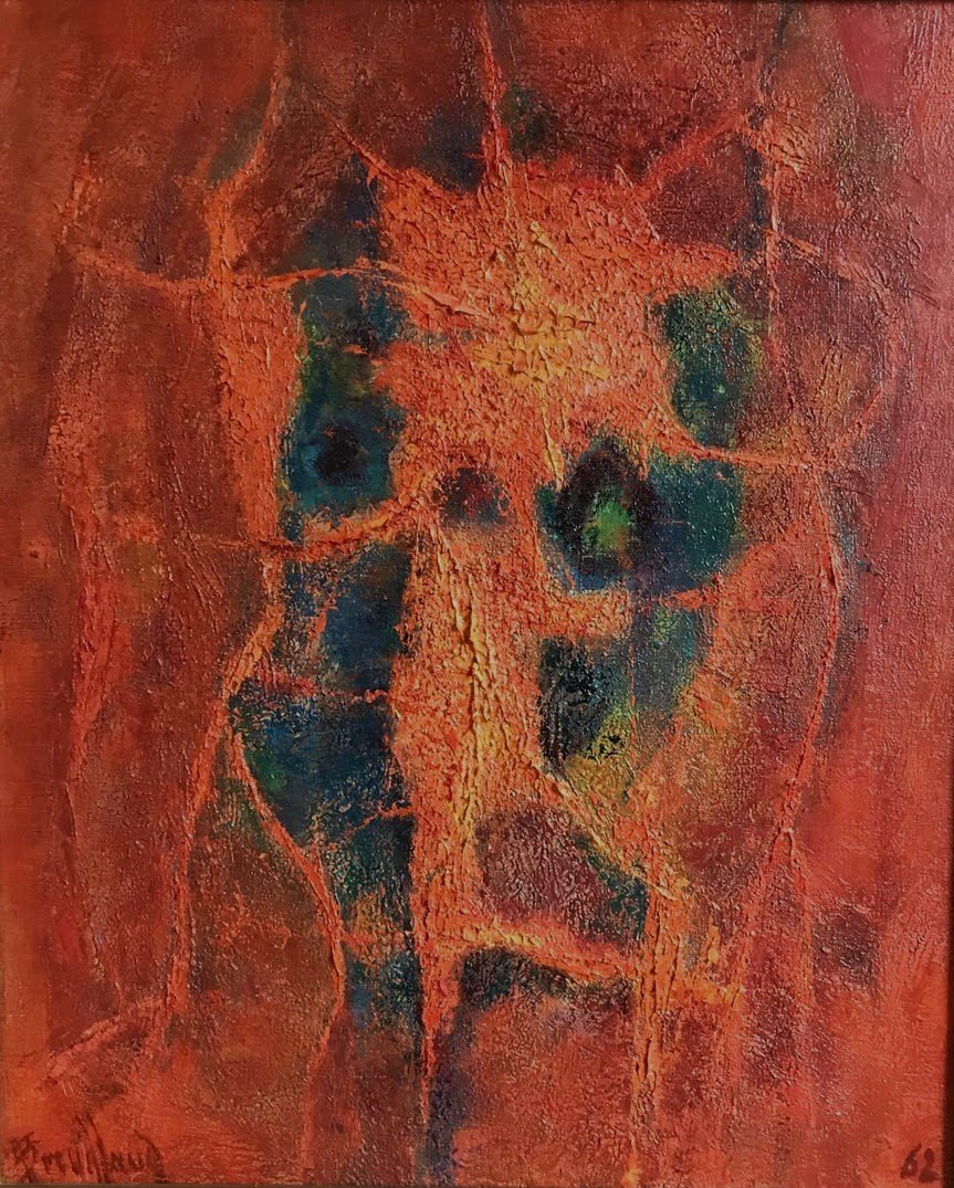
- Title : Incandescent Presence (conventional title)
- Date : 1962
- Technique : Oil on canvas
- Dimensions : 46 × 38 cm
- Location : Private collection
Biographical / historical context
This newly rediscovered work enriches the 62A group in the catalogue raisonné, devoted to Breuillaud’s explorations in 1962, in which colour and the material substance of paint participate directly in the emergence of forms. Its comparison with Dance of Fire, now catalogued as AB-62A-1962-012, makes it possible to examine two closely related formulations of the same pictorial language.
Both canvases combine a dominant orange-red, very dark blue-green areas and an uneven surface. Their dimensions are reversed: 46 × 38 cm for the present vertical composition, compared with 38 × 46 cm for the horizontal Dance of Fire. At a comparable scale, Breuillaud thus explores two ways of distributing masses and directing the movement of the eye.
This closeness is not sufficient to establish that the works were conceived as a pair. It nevertheless reveals a shared line of enquiry: red is not merely a background for separate motifs, but becomes the medium within which forms take shape, separate and come together.
Formal / stylistic description
The composition is organised around a central vertical zone, lighter and more animated than the edges. The red field varies between vermilion, orange, red earth and purplish brown. Yellow and ochre accents, particularly noticeable in the upper section and at the centre, illuminate certain raised areas of the paint.
Within this predominantly warm field lie several areas of dark blue, deep green and near-black. Distributed on either side of the central axis, they do not form a strict symmetry, but establish correspondences. On the left, a succession of elongated shapes and irregular compartments accompanies the composition’s upward movement. On the right, the dark nuclei appear more distinctly separated, sometimes rounded, sometimes angular.
Red and orange bands connect or separate these cooler areas. Their varying thickness, branching paths and changes of direction create a flexible framework. In the lower section, broader patches of reddish brown and violet slow this movement and provide a foundation for the whole.
The space has neither a horizon nor descriptive depth. Yet a sense of recession arises from the confrontation between luminous reds and dark nuclei. The latter may be perceived as openings or cavities, without needing to be identified as depicted objects. Red thus fulfils a dual function: it envelops the composition and constructs its internal divisions.
The surface plays an essential role. The visible irregularities, raised textures and discontinuities give the central areas an almost tactile presence.
The concentration of forms may suggest a frontal presence, even an upright organism. This reading remains suggestive: neither a face nor an anatomical structure emerges clearly enough to define a definite figurative subject.
Comparative analysis / related works
The principal comparison is with Dance of Fire, AB-62A-1962-012. Their kinship lies as much in the chromatic relationships as in the articulation of forms: the same dominant reds, the same blue-green counterpoints, the same irregular boundaries between warm fields and dark zones, and the same importance accorded to the textured surface.
The major difference concerns the direction of movement. In Incandescent Presence, the forms draw together around a vertical organisation. The cooler nuclei punctuate this upward movement and contribute to the feeling of a relatively stable centre. In Dance of Fire, the masses spread out more broadly, following curves and oblique lines that carry the eye from one side to the other.
The two works cannot therefore be reduced to a change in orientation of the same scheme. The newly discovered canvas favours concentration; the earlier-known work develops lateral tensions and connections between several focal points.
The comparison also cautions against automatically treating fire as a literal subject. The reds and oranges may evoke embers or incandescence, but this association remains interpretative. In the untitled work, what can be observed is the relationship between a warm envelope, dark interruptions and the internal organisation of the paint.
Displayed side by side, the two compositions show how a common vocabulary can produce two distinct sensations: a condensed presence in the vertical format and a more dispersed movement in the horizontal format.
Justification of dating and attribution
The inscription “62”, visible at the lower right, provides the principal basis for dating the work to 1962. The signature “Breuillaud”, at the lower left, and its formal proximity to Dance of Fire provide further support for the attribution.
The correspondence in palette, surface treatment and the organisation of coloured areas justifies bringing the two works together within the 62A group. It does not, however, make it possible to determine which preceded the other or to assert that they were executed during the same painting session.
The pronounced texture makes it necessary to avoid dating based on an overly systematic opposition between supposedly thinly applied paint in 1962 and thicker surfaces in subsequent years. Here, the dated inscription takes precedence over any such stylistic reconstruction.
© Bruno Restout — Catalogue raisonné André Breuillaud