Technical information
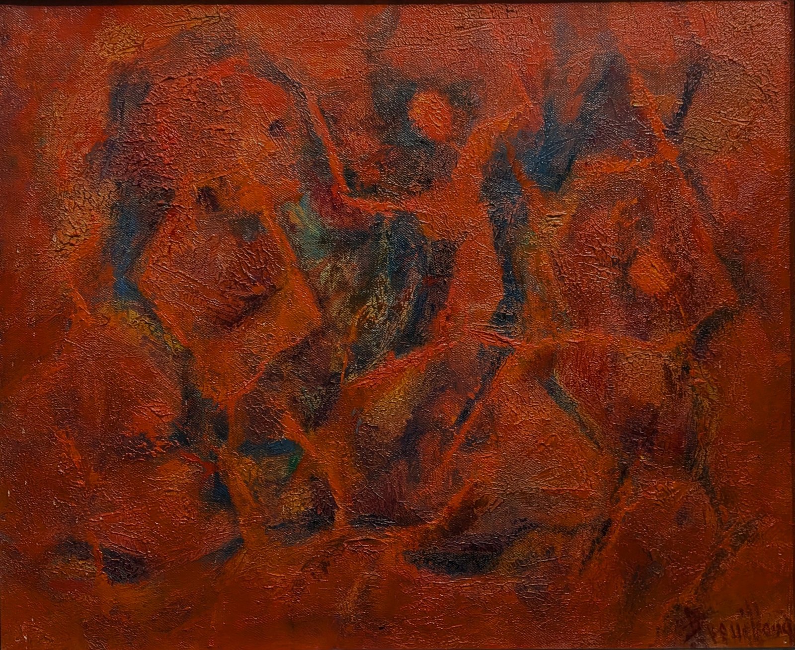
- Title : Dance of Fire
- Date : 1962
- Technique : Oil on canvas
- Dimensions : 38 × 46 cm
- Location : Private collection*
Biographical / historical context
The discovery of AB-62A-1962-011 makes it possible to reassess Dance of Fire through direct comparison within the corpus of 1962. The canvas no longer appears simply as an isolated experiment built around a dominant red: it belongs to a line of enquiry of which two closely related formulations are now known.
Their affinity concerns the palette, the distribution of dark areas within a warm field and the textured character of the surface. Their reversed dimensions—38 × 46 cm for Dance of Fire and 46 × 38 cm for Incandescent Presence—make the influence of format on the organisation of forms particularly apparent.
This comparison calls for a refinement of the earlier analysis. Incandescence remains a relevant term for describing the effect produced by the reds and oranges; by contrast, delicacy or transparency of paint handling can no longer be regarded as the painting’s dominant characteristics. The visible surface is dense, uneven and marked by raised textures that contribute fully to its expression.
Formal / stylistic description
The horizontal format contains an ensemble of red and orange masses articulated through interlocking and overlapping forms. The pictorial field is not clearly divided into background and figures: the same colours circulate through the larger forms, their boundaries and the intervals separating them.
On the left, a broad, partly rounded mass is traversed by dark accents and curving lines. The central zone presents a tighter interweaving of reddish-brown, deep-blue and muted-green areas. On the right, more elongated and curved forms extend this movement, without forming a symmetrical counterpart to the left-hand section.
The drawing proceeds less by continuous contours than by transitions from one colour to another. Orange fringes, dark interruptions and changes in texture are enough to bring boundaries into view. Certain masses may suggest fragments of silhouettes or profiles, but these suggestions dissolve as the gaze shifts. The work thus retains an ambiguity between abstraction and figurative reminiscence.
The surface is strongly animated. Granular areas, raised textures and networks of small discontinuities catch the light. Their distribution gives the red different densities: at times compact and dark, at others more vivid on protruding passages. The luminous effect therefore arises both from contrasts of colour and from the material presence of the paint.
Blue-green areas interrupt the continuity of the warm field. They do not constitute a second, independent motif, but rather internal articulations that alter the perception of the red masses. Their apparent depth heightens the sense of movement beneath the surface.
The title Dance of Fire may support this reading: the obliques, curves and changes of direction create movement without depicting an explicit scene. This does not, however, justify identifying distinct flames or dancers. Here, the “dance” designates a possible reading of the pictorial rhythm.
Comparative analysis / related works
Comparison with AB-62A-1962-011 now provides the primary point of reference for situating the work. Both canvases share a dominant orange-red and the same opposition between warm areas and blue-green nuclei. The comparison also concerns the sinuous boundaries of the forms and the presence of an irregularly textured surface.
The vertical composition Incandescent Presence gathers its main elements around a central axis. Its dark nuclei, distributed on either side, establish a relatively concentrated balance. Dance of Fire, by contrast, organises a more lateral movement: the masses follow one another, shift and propel each other in several directions.
One thus gives the impression of a presence gathering itself together; the other, of an organisation transforming as the eye moves across it. This difference does not necessarily indicate two stages in an evolution. It may represent two contemporary responses to the same compositional problem.
The newly discovered work also prompts a more nuanced view of the idea that Breuillaud’s explorations in 1962 lacked organisation. In both paintings, the profusion of material effects does not prevent a precise distribution of contrasts and masses. Red does not passively unify the surface: it links the forms while also allowing them to be differentiated.
These observations are sufficient to justify displaying the works together. They establish neither the existence of an original diptych, nor a preparatory relationship, nor an order of execution.
Justification of dating and attribution
The date 1962 is retained in accordance with the catalogue’s earlier classification. Comparison with AB-62A-1962-011, which bears the inscription “62”, lends further stylistic support to this date, without replacing the documentation specific to the canvas.
The signature visible at the lower right and the correspondences in pictorial vocabulary between the two works support the attribution to André Breuillaud. Their proximity is apparent in the red–blue-green harmonies, unstable contours and the structuring role of texture.
© Bruno Restout — Catalogue raisonné André Breuillaud